For my 100th guitar, I wanted to do something special. I had long been interested in building with a design motif that incorporated elements from my past experience building homes and furniture. In August of 2013, the stars aligned. A client asked me to design and build a guitar with an “Arts and Crafts” motif. I drew two very different preliminary designs and decided to build them both as my 99th and 100th guitars. The design work was done in a long-distance collaboration with my client and we are pretty darned happy about how it came out. I offered the client his choice between the two and he chose #100 so #99 is currently for sale here.![]()
 The first guitar used an interpretation of a Craftsman theme. The American Craftsman movement grew out of the larger Arts and Crafts movement in England at the end of the 19th century. Socially, it was a movement away from industrialization and factories and back to individual craftsmen. Esthetically, it was a rejection of the showy ornamentation of the Victorian era in favor of clean design that features the inherent beauty and texture of natural materials. I was familiar with the Craftsman furniture of Gustav Stickley and that became one influence for this guitar. In an advertisement for his Morris Chair, Stickley wrote, “This piece shown here is first, last and all the time a chair, and not an imitation of a throne, nor an exhibit of snakes and dragons in a wild riot of misapplied wood-carving. The fundamental purpose in building this chair was to make a piece which should be essentially comfortable, durable, well-proportioned and as soundly put together as the best workmanship, tools and materials make possible.” Substitute “guitar” for “chair”, and that pretty well sums up my design philosophy: Handmade objects should be beautiful, but form follows function. Incorporating a Stickley esthetic, however, presented some challenges. The style is planar and rectilinear, not exactly a natural fit on a guitar. The challenge was to complete a design with integrity throughout as opposed to pasting on a few Craftsman details and calling it good.
![]()
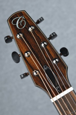
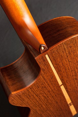
We decided early on that we didn’t want the guitar to be a complete departure from my current designs so a contemporary Craftsman interpretation was in order. We started with the headstock and neck. Since my standard headstock has no straight lines, we went with a headstock shape that I use for slotheads. It has an outward taper that gives it a more solid, substantial look and it has two straight edges. I then had the idea to make the truss rod cover mimic the exposed tenons in the arms of a Morris chair. We made it trapezoidal to mirror the headstock shape, a theme that is repeated in the tuner buttons, backstripe, and end graft.![]()
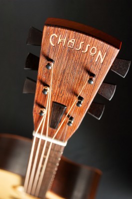
My client suggested the Craftsman font for the logo and I came up with the idea of doing it as an underlay (as opposed to an inlay) in a contrasting wood. The truss rod cover above the surface and the underlay below then became another repeated design element.
The headstock is the only planar surface on the instrument and I wanted to emphasize that aspect. I devised a way to inset the tuner bushings from the back so there is one less interruption in the planar surface.![]()
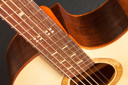 Squares and groups of squares are another theme in Craftsman design. We used that idea for position markers, which were done as underlays as well.
![]()
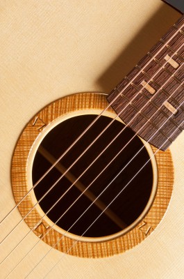
The idea for the rosette came to me at the end of the design process after building had started. Even though it’s purely ornamental here, the dovetail seemed appropriate for its symbolism: It calls back the sturdy, exposed joinery of Craftsman furniture, and it’s synonymous with harmony and a good fit. It also adds a bit of motion and asymmetry to the design which fits the contemporary interpretation. Like many of the design elements, it doesn’t scream for attention but rewards a close look.
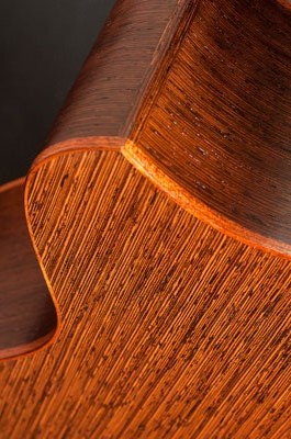
The traditional wood used in Craftsman furniture is white oak. We talked about using it for the back and sides but decided on wenge for tonal reasons. The wenge has the open-pored texture of oak and the strait grain doesn’t draw focus from the design highlights. A glossy finish doesn’t fit the style so we decided on an open-pored satin finish to highlight the natural texture in the wood.![]()
For #100, I decided on a Prairie Style motif inspired by Frank Lloyd Wright. Since a guitar doesn’t lend itself to a hipped roof and strong horizontal lines, I turned to some of Wright’s art glass for inspiration. We started with the peghead again, this time using my standard profile. One element of prairie style involves integration with the natural world. After trying some abstract geometric patterns, I settled on tulips and wheat.![]()
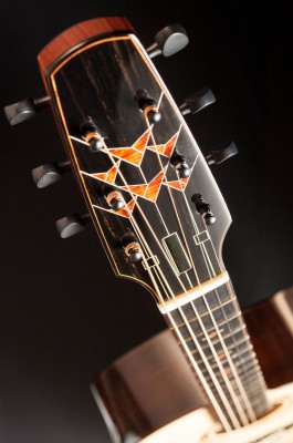 In Wright’s tulip patterns from the windows of the DeRhodes house, I found an element that worked well on the headstock. Again, I incorporated the truss rod cover into the design and attached it with a screw from the back side to keep the face clean. As in #99, I recessed the tuner bushing from the back so there is less to distract from the inlay.
Since no prairie is complete without wheat….
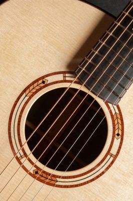
Sometimes it’s simple to take an idea from initial concept to final design. The fit and proportion of the tulip pattern on the peghead was pretty straight forward. Not so the rosette. I drew at least a dozen different rosettes with similar wheat patterns until we hit upon this one. Even after we decided on 3 segments (a reference to my standard rosette), getting the proportions right took a few tries.![]() I
I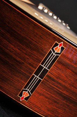 repeated the wheat pattern in the back stripe and tried to reinforce the stained glass look with the light spruce background. The idea is of light coming through.
We found more opportunities for tulips in the end graft and 12th fret marker.
The back and sides are Brazilian Rosewood, the top is Engelmann Spruce, and the fingerbaord, headplate, and bridge are ebony.![]()
